Trends in Paint Colors for 2014

Hi Remodelaholic friends! I’m Cyndy from the blog The Creativity Exchange and I am so excited to be talking paint colors on Remodelaholic as the new Color Palette Contributor. I have some great color inspiration coming up for you in 2014 and I am really looking forward to sharing a monthly paint color palette with you.
Last year, I started a tradition where I highlighted my favorite colors from the color forecasts from the various paint companies for the next year. More than any other design/color forecast that comes out, I look forward forecasts from the major paint companies because they are the most accurate indicators of the trends in paint color. Today, I wanted to kick off the new year by highlighting some of my favorites from the 2014 paint color forecasts.
2014 Trends in Paint Colors
**All the images today are paint colors from the 2014 paint color forecasts. You can find the name and brand of the color below each image
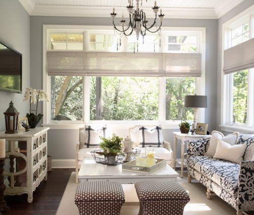
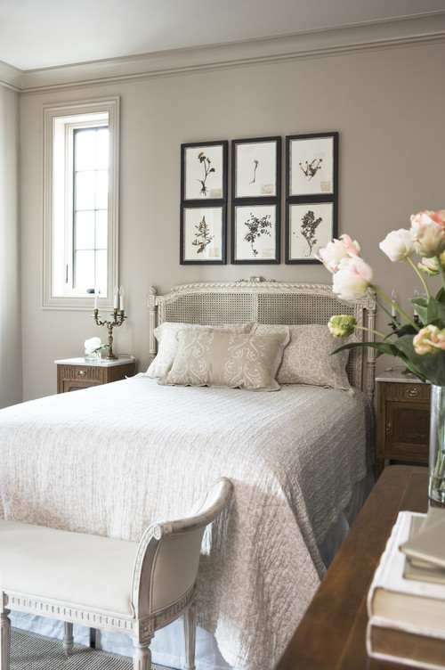 Transitional Bedroom by Greenville Interior Designers & Decorators Linda McDougald Design | Postcard from Paris Home
Anew Gray by Sherwin Williams
Paint companies predominately base their forecasts on their current bestselling paint colors and what the consumers are actually buying and painting on their walls. The best part of this is that paint companies have programs to track even the slightest changes in undertones as we buy paint color and move from one color to another. The combined mix of all this information gives paint companies near perfect precision in determining where consumers are heading in paint color.
Crushed Ice by Sherwin Williams
I was really blown away when I saw both Benjamin Moore and Sherwin Williams’ 2014 forecasts. I really think they nailed it in a big way and I was really excited to see some of the new colors.

Van Deusen Blue by Benjamin Moore
Both Benjamin Moore and Sherwin Williams emphasized the same key words in describing their 2014 forecasts; muted, serene and simplicity. I can see why because I think a lot of us right now are looking for calm neutrals rich in depth wall colors but yet simplistic. I attribute the “calm walls” to all of the fun we are having with our bold colors, patterns and finishes in our accessories and accent pieces rather than our walls. We need calm and muted wall colors to offset all of the fun we are having with bold.
Distant Gray by Benjamin Moore
With all of this said, I never make design or paint color decisions based on a trend or a forecast. However, it’s such great information to find out what undertones and colors are popular in paint and where paint colors are heading because it’s a great starting point when looking for colors that will be around for awhile.
Earl Grey by Benjamin Moore
Wickham Gray by Benjamin Moore
I especially loved the colors in the “Reasoned” section of the Sherwin Williams forecast and it was by far my favorite out of all that Sherwin Williams forecasted for 2014:

These colors while muted, serene and simplistic are incredibly rich in depth. It’s so hard to find muted and simplistic that are not sterile. You can go find Sherwin Williams complete 2014 Color Forecast here. Benjamin Moore has come out with Color Trends 2014 “The New Neutral Palette”. In the past they have come out with several collections but all I have seen is this smaller collection. It too is fantastic:

To see a closeup of all of the colors and to read about Benjamin Moore’s “New Neutral Palette”, you can find it here.
For today’s palette that I’m sharing, I narrowed in down and picked eight of my favorite colors from both the Sherwin Williams and the Benjamin Moore forecasts that have a history of looking fantastic on walls in various lighting situations:
If you’re looking for a particular color, today’s color palette is great place to start. All of these colors are calm and serene but still have a lot of depth to them. So, is there a color jumping out a you? I would love to know which one is your favorite and what you think of the colors forecasted! I think my favorites are Van Deusen Blue and Crushed Ice.
By the way, if you want to see more rooms with exact paint colors, you can check out my Pinterest Board “Pick a Paint Color” here, where I have more than 300 rooms with specific paint colors pinned. If you need a little more help and want to know where and how to get started in determining what paint colors will work in your home, you can check out this post I wrote here as a starting point.
I hope there’s a color here that inspires you. I’ll be back next month with another paint color palette and more inspiration.
Cyndy
————————————
More paint color inspiration from Remodelaholic’s best paint colors series
Cyndy is a color expert who has transitioned from the fashion world to the design world by helping others choose just the right paint colors for their homes. Cyndy takes the guesswork out of choosing paint colors and has been sharing her tips and paint color palettes with her readers for more than four years on her blog The Creativity Exchange.
Cyndy lives in East Texas and is an artist working with designers to create commissioned paintings that enhance the color and design of a space.


Hi, I like your posts and ideas. Not to be a jerk, but you are misusing the word simplistic. It detracts from your post. Feel free to delete this comment, but you might want to think about correcting that word usage. It’s like calling the colors ‘moronic’.
ThesaurusAntonymsSynonymsLegend:
Adj. 1. simplistic – characterized by extreme and often misleading simplicity; “a simplistic theory of the universe”; “simplistic arguments of the ruling party”
simple – having few parts; not complex or complicated or involved; “a simple problem”; “simple mechanisms”; “a simple design”; “a simple substance”.
So to state that a color can be “muted and simplistic without being too sterile” is actually being used in correct context. I’m not sure why you don’t think it sounds correct and why you took the time to state so without checking a thesaurus.
Great Reply!!! Don’t you just love idiots that have to try to be “NEGATIVE ” about everything! 🙂 I love the new colors , my whole entire house just got finished being painted grey!
LOVE these colors! We have Peppercorn as an accent wall in our office and it’s such a great color- it has a rich undertone and never looks flat or dull like some darker colors. We have one last room to paint in the house (for now- until we change our minds and repaint something of course!) and one of these 2014 colors might work perfect : )
I’m glad to hear that you love Peppercorn in your home! I have heard such great things from my readers that have used it and absolutely love it. It really is one of the great rich colors that just works well in a lot of lighting situations. Yes, I hope one of these colors that I shared in this palette jump out at you. Thank you so much Jodie for your comment!
Am looking at paint colors to redo my kitchen and am thinking about crushed ice by sherwin Williams, love your paint blog
Awe thanks Jeri! Thank you for keeping up all these years girl! Crushed Ice would be a fantastic choice! You’ll have to let me know what you color you ultimately choose! Thank you so much Jeri for your note!
Great post. We painted my daughter’s room Van Deusen Blue three years ago and we still love it. White curtains, white bulletin board, and a mixture of black and white furniture. It’s so rich!
Oh that sounds gorgeous Beth, especially with the crisp white! I was really excited to Van Deusen Blue in the 2014 forecast! Thanks so much Beth for your comment!
My upstairs family room and kitchen walls are painted a brown color ( I don’t remember the color name ). My furniture is brown leather and I’m using black, red, and some medium yellow colors as accents. Here’s the problem. My husband recently changed our downstairs family room to gray. The walls and carpet are now gray. They look great but, the stairway connecting the upstairs and downstairs is open. Therefore, the beige flecked carpet buts up against the gray carpet at the bottom of the stairs and the brown wall meets up with the gray wall right where the steps and wall do a slight curve before getting to the bottom of the steps. He thinks it’s fine. It isn’t. What color can I paint the upstairs that will blend with both color schemes?
Thanks so much for such a great post. I hope I can be helped.
Peggy
Thank you Peggy for your note! What you’re describing is one of the most popular questions that I receive about paint colors. One room has warm tones and the other room has cool tones and trying to figure out what needs to connect them in a color is difficult. I would recommend looking at light colors that have a mix of warm and cool undertones. Light (almost white) colors that are rich in depth that have a balanced mix of warm and cool are the perfect connectors in situations like you have.
I hope that helps Peggy and would love to know what you choose! Thanks so much for stopping by!
Hi Cyndy,
Congratulations on being a new contributor! I look forward to following these posts. I always have trouble with color and need help!
I was just wondering if it’s at all possible (I don’t know if technically it is) to put the links to the exact rooms pictured our the project the room is from, along with the other links. The “transitional bedroom” and “traditional bathroom” links had at least 8 or 9 pages each to look through to find them and the links to the designer pages (while good to have) are even harder to find the room from. Or even better, the room link from the designer’s actual website (I might be wrong about this, but I see Houzz as like Pinterest [but strictly for home design] in that it’s a bookmark/search engine to the actual sources but isn’t the source itself for the most part). That would be so great! Thanks!
Thank you for your comments and suggestions Mary. I’m so excited to be contributing on Remodelaholic.
The designers and builders upload their projects to their pages/profiles on Houzz. The designers choose to share via Houzz and this is where they discuss product details (like paint colors)and specs for their projects. It is different from Pinterest because only the designer of the project can upload projects. They are in complete control and know that bloggers will use an embedded link (which I used from Houzz) that credits them. I hope that helps Mary.
The link is actually the embedded code that the designer and Houzz want bloggers to use when we share via our blogs. If you look to the right of the image on Houzz, there is a collection of photographs and that will be all the pictures of that particular space. Thanks so much for stopping by Mary.
The caption states that Crushed Ice is from Benjamin Moore. The chip photo shows it is from SW.
Thanks Nancy for letting us know. We will change the caption under the image to Sherwin Williams! Thank you so much for catching that!
Love these colors! It makes choosing colors so much easier to see things that go well together all laid out.
Hi. Is Crushed Ice a Sherwin Williams color as the color chip states or is it by Benjamin Moore as the photo says. I’m looking for a gray for my main floor and I like this shade. Thanks!!
Crushed Ice by Sherwin Williams is really a fantastic color! I think it would be a fantastic open floor color but just to be safe, I would recommend painting a poster board and taping to the wall just to test out in the lighting in your space. I hope it works Kathe and would love for you to let me know what you decide to do.
Love all the colors you have selected. Your blog is always one of my very favorites since I have been reading blogs. You never let me down. I have learned so very much from you and very much appreciate it.
Thanks as always for sharing and teaching !!!!!
Thanks for reading Debbie!
I wonder how the Van Deuson Blue would look in a dining room? I have a crystal chandelier, deep brown antique furniture, oriental rug, but some more modern accessories. Could you go with a glossier wall finish with this color? Or better with satin?
Aren’t colors regional? I live in the PNW where we have lots of gray days. I like your color choices but wonder how they would be received here.
Also, is it a new trend the paint the ceiling the same color as the walls? I’m seeing it more often these days.
Thanks!
Love your site!! I am looking for a darker color to paint my inside front door that will go well with BM gray owl (the one with blue undertone). Any help would be so appreciated!!